GLG 4.5 Release: New Features and Enhancements
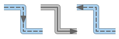 Bidirectional Flow Pipe Widgets
with Color Flow Dynamics
 Value Display Widgets with
Selectable Color Alarm Logic
 Tank Widgets with
Selectable Color Alarm Logic
New Real-Time Chart Features
AutoScaleMargin to Specify Headroom Space
A new AutoScaleMargin plot attribute may be used to specify a
"headroom" space to be maintained between the plot and the top/bottom of
the chart's data area. If chart autoscaling is on, the chart will adjust
its high and low settings to maintain the required headroom space if the
plot line gets too close to the top or bottom of the data area. This may
be used to make a plot line better visible when it gets close to the top
or bottom edge of the chart.
Positive values may be used to specify a pixel-based headroom
space. Negative values may be used to specify a headroom space as a
percentage of the plot's initial range.
Support for Chart EntryPoints That Combine
Several Input Variables
GLG transformations may now be used to calculate a plot value based on
the input from two or more variables. For example, a transformation may be
used to calculate an average value of two input variables. In
previous releases, if a transformation with several input variables was
attached to a plot entry point, supplying new input values for the
transformation would result in multiple data samples being pushed into the
plot, with only the last one being correct. In the new release, handling
of transformations with several inputs attached to a plot entry point has
been improved, making it possible for a chart to properly display the
output value of such transformations.
Incremental Change Transformation
A new Incremental transformation may be used to implement gradual
changes of D (double) or G (point or color) attributes. For
example, if an Incremental transformation is attached to a D
attribute, the value of the attribute will gradually change when a new
target value is set. The gradual change animation will stop when the new
value is reached. The transformation can also be attached to control
points or color attributes to gradually change them when new point
coordinates or a new color is set.
The transformation has a Target attribute which specifies a target
value, and a Num Steps attribute that specifies the number of steps
used to gradually adjust the value. Similar to a Timer
transformation, the Incremental transformation has a
Time Interval attribute that specifies an interval between the
adjustment steps in seconds, and an Enabled attribute.
If Enabled is set to 1, setting the Target value will cause
the output value to gradually changes from the current value to the target
value. If Enabled=0, incremental change is disabled and the output
value changes right away when the Target value is set.
On the initial drawing, the Target attribute is used as the
initial value which is set right away without incremental
adjustments. After that, setting a new Target value triggers
incremental adjustments specified by the Num Steps and
Time Interval attributes.
The Target value may be set at any time even if the previous
target value has not been reached, in which case the output value will
gradually adjust to the new target value.
"Play Once" Animations and Animation Triggers
In previous releases, a Timer transformation could be used to
implement continuous animations controlled by the transformation's
Enabled attribute. In the new release, two more attributes were
added to the timer transformation that allow to use it for play-once
animations:
- The Stop After attribute defines the number of intervals the
timer animation will run for after being activated. If the
transformation's Enabled attribute is set to 1, the animation
will start and will run for the number of intervals specified
by Stop After. When the animation stops, the transformation's
Enabled attribute will be reset to 0.
- The Trigger attribute may also be used to start the
animation. Setting Trigger to 1 will set the Enabled
attribute to 1 which will start the animation. When the animation
stops, the Enabled attribute will be reset to 0, but the
Trigger value will not be reset. This makes it possible to
constrain Trigger to the output of another transformation that
monitors some condition and sets Trigger=1 when the condition
happens. For example, it can be used to trigger a temporary animation
when the value of some variable reaches a predefined limit. The
animation will be repeated if the value decreases, then increases and
reaches the limit again.
The animation can be stopped at any time before it reaches the
Stop After limit by resetting the transformation's Enabled
attribute to 0.
In previous releases, the Compare/Min/Max transformation provided
functions for determining the maximum and minimum values of two
parameters. In the new release, the min/max functionality is implemented
by a separate Function transformation that implements various
functions of two arguments, including the min/max and absolute value, as
well as functions for double to integer conversions. It also includes
simple linear functions of two arguments that may be used instead of a
more complex linear transformation when just two input variables are
involved.
The following functions are provided:
- min( A, B )
- max( A, B )
- abs( A - B )
- round( A )
- floor( A )
- ceil( A )
- trunk( A ) - integer cast
- A + B
- A - B
- A * B
- A / B
- A % B
- trunk( A / B ) - integer division
where A and B are the two transformation parameters.
If a drawing created in the previous releases is loaded, the
Compare/Min/Max transformations that use min/max functionality are
automatically converted to the new Min/Max/Abs transformations.
New True Value and False Value attributes of
the Compare transformation allow the user to specify the output
values for the true and false comparison results.
In previous releases, the output of the comparison was always 0 or 1.
New Embedded Shell Viewports
A new GLG_EMBEDDED_SHELL shell type can be used instead of the
GLG_DIALOG_SHELL shell type to implement floating dialogs that do
not depend on the windowing system and behave identically in all supported
deployment environments: C/C++, C#, Java and JavaScript on both Windows
and Linux. The embedded shell viewports are displayed inside the parent
viewport's window and display a title bar that can be used to position the
dialog by dragging it with the mouse. The embedded shell viewports do not
depend on the windowing system for its positioning and isolates it from
the deployment platform differences.
Support for .NET Core
The new release supports several versions of .NET, including both the
.NET Core and .NET Framework:
- .NET Core 8
- .NET Framework 4.8
- .NET Framework 4.6.2 (Legacy support)
The lib directory of the GLG installation contains several .NET
subdirectories with different versions of the GLG .NET DLLs.
New Web and JavaScript Library Features
Enchanced Handling of Web Browser Zooming
In the previous releases, browser zooming was handled by the browser and
caused GLG canvases to be scaled as images, causing pixelization. In the
new release, the GLG Library handles browser zooming by resizing all
canvas content according to the current browser zoom level, which yields
smooth graphics and avoids pixelization.
The updated GLG JavaScript demos on the Generic
Logic's web page demonstrate the new functionality. The demos use a resize
listener and invoke the SetCanvasScale method of the GLG JavaScript
Library to adjust canvas resolution based on the selected browser zoom. In
previous releases, SetCanvasScale was invoked only once on startup
to adjust canvas scale when displayed on mobile devices with device pixel
ratio greater than 1. The SetCanvasScale method has two new
parameters described in the ZZZZ New API Methods section to better handle
browser zooming.
React, Angular and Next.js Integration
The new release provides React, Angular and Next.js components
that integrate GLG into these frameworks using a native React, Angular or
Next.js GLG Component.
The provided React, Angular and Next.js GLG Components handle
peculiarities of each framework, making it possible to completely separate
GLG-specific application code and make it independent of the framework it
will be used in. This made it possible to share the code of each
GLG demo and example
between the React, Angular and Next.js versions, as well as
the pure HTML version, without any changes.
The components integrate the GLG-specific application code and the
associated GLG drawing into the React, Angular or Next.js framework, and
make it easy to instantiate several copies of the component on a web page.
For example, multiple instances of the GLG Viewer or the GLG Real-Time
Chart can be displayed on a web page by simply using the corresponding
component multiple times. The integration components use a modularized
version of the GLG JavaScript Library described below.
Examples of using GLG in the React, Angular and Next.js environments are
provided in the following directories of the GLG installation:
- examples_react
- examples_angular
- examples_nextjs
The examples contain complete source code as well as the deployment
instructions.
Click on the following link to view React or Angular demos:
https://www.genlogic.com/demos.html
Modularized Version of the GLG
JavaScript Library
The GLG JavaScript library can be deployed either as a module or as a
script. Two versions of the GlgToolkit library file are provided in the
new release: the GlgTookit.mod.js can be used as a module, while
GlgToolkit.js can be used as a classic script. The corresponding
Intermediate and Extended API versions of the GlgToolkit file are also
provided. The Glg*.js and gunzip.min.js files can be used
with either a module or script version of the GlgToolkit file.
Modularized Demos and Examples
The source code of all GLG
demos and examples was updated to use modules. This makes it
possible to use this source code without any changes in both the
standalone HTML demos, as well as in React, Angular and
Next.js frameworks described above. It also makes it possible to
deploy multiples instance of each demo or example, such as the GLG
Viewer or the GLG Real-Time Chart, on the same web page.
Bidirectional Flow Pipe Widgets
with Color Flow Dynamics
New Bidirectional Flow Pipe widgets have been added to the
3D Pipe Widgets palette. The widgets' Value property controls
the flow direction and widget color: the flow direction gets inverted when
the value changes its sign from positive to negative. If the value becomes
0, the flow stops and the pipe color changes to a dim color to indicate the
stopped flow. Both polygon and spline-based pipes are provided.
New indicator widgets allow the user to select the logic that changes
indicator colors to show alarm conditions. In previous releases, alarms
colors were controlled by the AlarmStatus property that supplied
the alarm color index. In the new release, a new UseStatus property
selects the alarm logic to be used:
- If UseStatus=0, the Value property controls alarm
colors based on color thresholds, without a need to supply an
additional alarm status value.
- If UseStatus=1, the Status property supplies color
index the same way as it was done in the previous releases.
The NumColors property may be used to change the number of colors
and thresholds used to display alarms.
New tank widgets allow the user to select the logic that control the
display of alarm colors. Same as in the indicator widgets described above,
the UseStatus property specifies if alarm colors are controlled by
the Status property, or selected based on a value of
the Value property and the specified thresholds.
The NumColors property may be used to change the number
of colors and thresholds used to display alarms.
Miscellaneous GLG Editor Interface
Enhancements
- If the user modifies the value of the drawing
viewport's FonttableFile attribute in the HMI Configurator, the
modified value is saved with the drawing. Previously, the modified value
was saved only for child viewports, but not the top viewport of the
drawing.
- The Grid settings defined in the GLG configuration file
(glg_config or glg_hmi_config) are now preserved after
creating or loading a new drawing.
New API Methods
New Method for Configuring Viewport
Windows
A new GlgConfigureWindow method may be used to set size and/or
position of a viewport's window. In previous releases, the size and
position of the top-level viewport window were set by setting hints of the
viewport's Screen object and resetting viewport's control point
positions to (0;0;0). While this deprecated technique is still supported,
the new method provides a more convenient and more powerful alternative
which is available in all supported GLG deployment libraries: C/C++, C#,
Java and JavaScript.
The new method sets a viewport's window size and/or position in screen
coordinates and may be used to do so for any viewport, including top-level
viewports and child viewports. For top-level viewports, the x and y
position parameters specify the position in screen coordinates relative to
the origin of the screen. For children viewports and embedded dialog
viewports, position parameters specify the position relative to the origin
of their parent viewport's window. The last parameter of the method
supplies the bitwise flags that control the action to perform: set size,
set position or both.
Once the viewport's size or position is set using
GlgConfigureWindow, the viewport's control points are no longer
used for controlling the viewport's size and/or position. If only the
viewport's position is set and not its size, the size will be still
controlled by the viewport's control points, and vice versa if only the
size is set and not the position. The flags parameter of the method
contains options to restore the use of the control points for determining
the viewport's size or position after it was set
with GlgConfigureWindow.
New API Method for Updating Chart State
A new GlgUpdateChartState method may be used to update chart state
after prefilling the chart with datasamples. The last parameter of the
method specifies bitwise flags that control what action to perform: update
autoscaling, update scrollbars or trim datasamples in the chart buffer. In
previous releases, a more elaborate sequence of function calls had to be
used to update the chart state.
Return Value of
AddDataSampleNode
The return value of the AddDataSampleNode method (and
AddPlotDataSample in JavaScript) was changed from void to
boolean to return the success or failure status. This makes it
possible to abort prefilling the chart if the chart is not ready and the
first invocation of the method fails.
New Diagnostic Methods
Two C/C++ methods for printing out object count were added in the new
release:
- GlgPrintObjectCounts prints total object count for each of
the GLG object types
- GlgPrintObjectCountChanges prints object count changes since
the last call to this method.
These methods may be used to diagnose memory and object leaks. On
Windows, object counts output is stored in the GLG log file
(glg_error.log). On Linux/Unix, the output is also printed to
stdout.
Enchanced SetCanvasScale Method
The SetCanvasScale method of the GLG JavaScript library is used to
adjust canvas resolution to match the device pixel ratio on mobile
devices, or if the pixel ratio changes due to browser zooming. In the new
release, two new parameters were added to the method to better handle
browser zooming:
- PixelOffsetScale provides a scaling factor for pixel
offsets used in screen pixel offset transformations
- ScreenCoordScale provides a scaling factor for fixed scale
viewports that use screen coordinates.
In most cases, these parameters may be set to
window.devicePixelRatio. If the parameters are omitted, pixel
offsets and fixed scale viewports are not scaled to match the behavior
used in previous releases.
The use of the new parameters also allowed to eliminate most of the
mobile device adjustment code used by the GLG JavaScript demos in previous
releases to adjust drawings when displayed on mobile devices with device
pixel ratio greater than 1.
New Online Documentation
New online documentation for
the C and C++ APIs is now available, as well as revamped online
documentation for the C#,
Java and JavaScript APIs.
Two sets of online documentation are provided:
- API documentation with functions inside each API grouped into
categories based on their usage, which is helpful for learning
GLG API functionality
- API documentation that presents functions inside each API as a
flat list, which is convenient when searching for a
function description.
Bug Fixes
- Fixed the initial positioning of the GLG_APPLICATION_SHELL
shells in the GTK version of the GLG Toolkit on Linux.
- Fixed errors generated when prefilling a chart causes scrollbars to be
activated.
- Fixed double-mapping of dialog viewports in C#.
- Fixed OpenGL memory leak when extended characters, such as a degree
character, were used in the OpenGL Compatibility Profile. The OpenGL
Core Profile was not affected.
- Fixed crash in the GlgGetTagObject method when searching for a
single OUTPUT tag.
- Fixed an exception on autocomplete in the text input field when
selecting an autocompletion choice with the mouse in the GLG JavaScript
library.
- Fixed GlgNList list handler behavior in JavaScript when
displayed on mobile devices.
